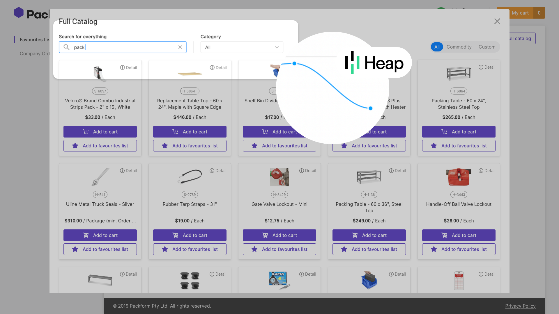
Scaling UX for America’s Largest Packaging Network
Redesigning What Wasn’t Working
Executive Summary:
At Packform, I led a full redesign of a fragmented B2B platform connecting suppliers, dealers, and customers. As the sole UX/UI designer, I transformed inconsistent UI and unfinished workflows into a cohesive, scalable system. By cleaning up visual noise, fixing clunky interactions, and aligning design with brand and user needs, I helped Packform enhance trust, reduce friction, and scale its platform toward becoming the USA’s largest packaging network.
The result:
Delivers a streamlined procurement experience, user-focused B2B platform that reinforced trust, reduced friction in quoting and order workflows, and helped position Packform as a scalable contender in the U.S. distribution market.
Website
Primary Role
UX/UI Designer (Lead)
Time Frame
2022
Company Size
$25 million in funding
Project Model
Cloud-based B2B SaaS platform
Tools
Figma, Zeplin, Heap analytics, Trello, XD, Adobe suite
From Fragmented to Functional ⚙️
When I joined Packform, the platform was already gaining traction in the U.S. market—but the design was holding it back. The interface was visually inconsistent, cluttered with overlapping modals, off-brand colours, and a fragmented UX across suppliers, dealers, customers, and admins.
What I walked into wasn’t just a UI cleanup—it was a chance to rethink how each part of the ecosystem worked together. I audited incomplete user flows, restructured navigation, streamlined quoting logic, and unified the platform visually with scalable design patterns aligned to brand.
This redesign not only improved usability and trust but also laid the foundation for Packform to scale as a leading B2B SaaS solution in the U.S. packaging space.
How Packform works
Packform is a B2B SaaS platform that streamlines procurement by connecting customers, dealers, and suppliers.
Customers place orders through the platform.
Dealers manage the entire process—from quoting to sourcing, ordering, and delivery.
Suppliers fulfill orders by shipping products directly to the customer’s address provided by the dealer.
Admins oversee user management and maintain platform operations.
While suppliers handle fulfilment, it’s the dealer’s responsibility to coordinate every step, ensuring a seamless experience from quote to delivery.
Repairing the Experience, One Role at a Time
CUSTOMER EXPERIENCE
Key Finding (Heap analytics):
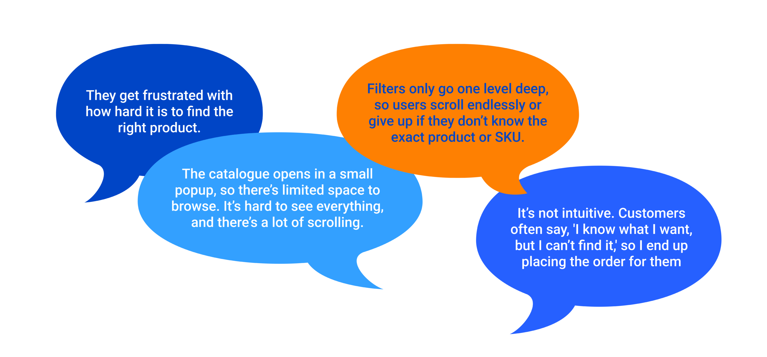
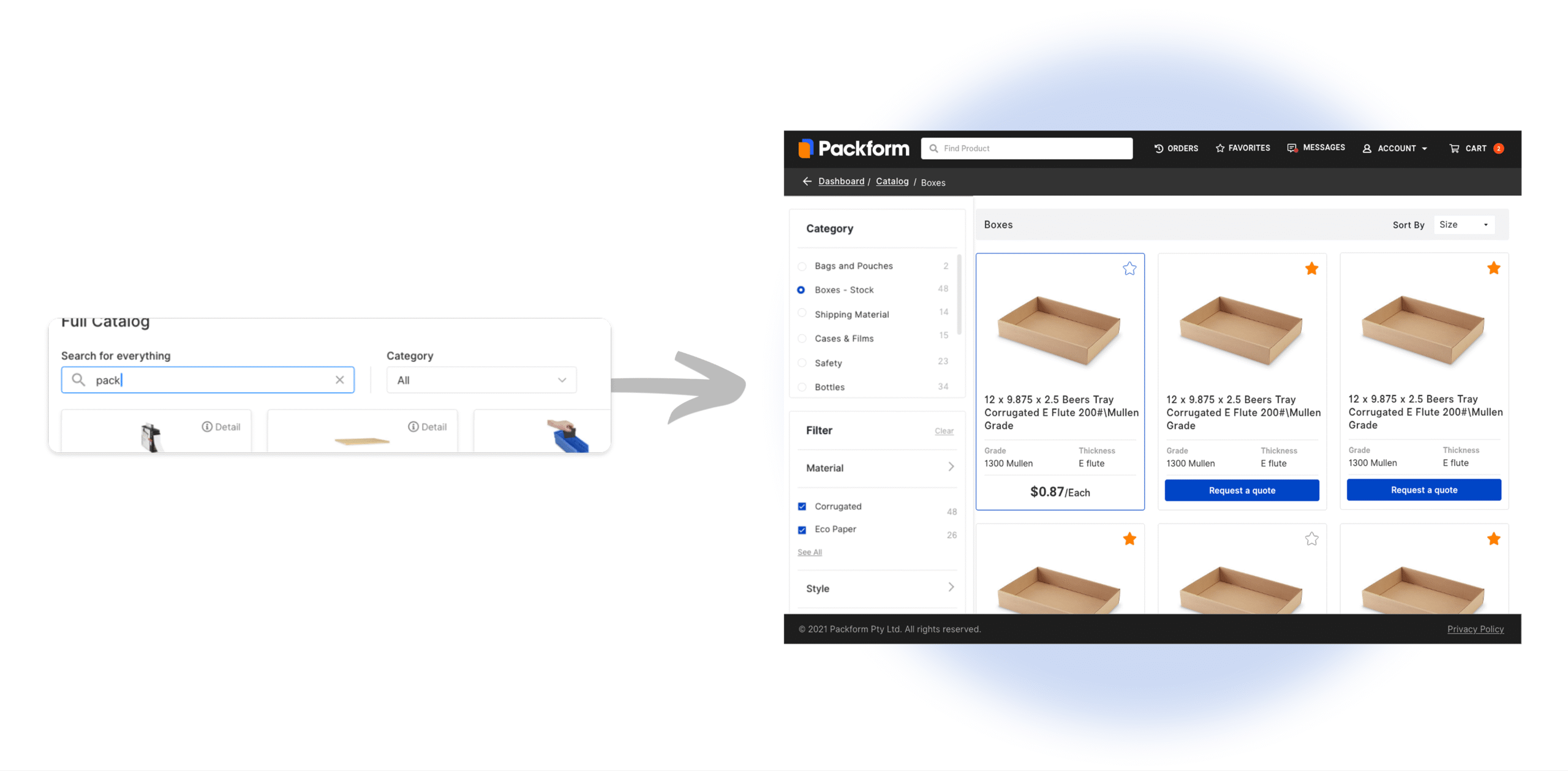
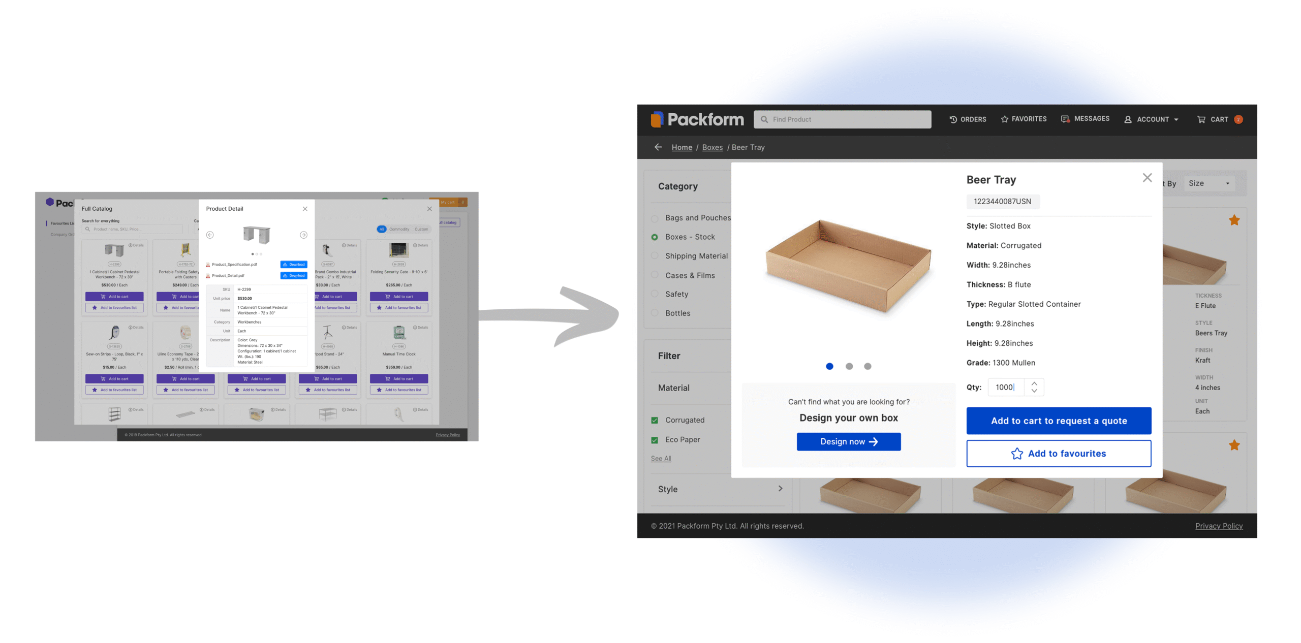
Heap Analytics revealed a significant drop-off at the search and filtering stage of the customer journey. Users were exiting the platform during product discovery, indicating that the existing catalogue structure and filtering experience were not meeting their expectations or needs.
To understand why users were dropping off at the search stage, we interviewed a U.S.-based dealer. Drawing from daily customer interactions, they shared clear pain points around product discovery, filtering, and overall catalogue usability.
Dealer Interview Excerpt — U.S. Dealer
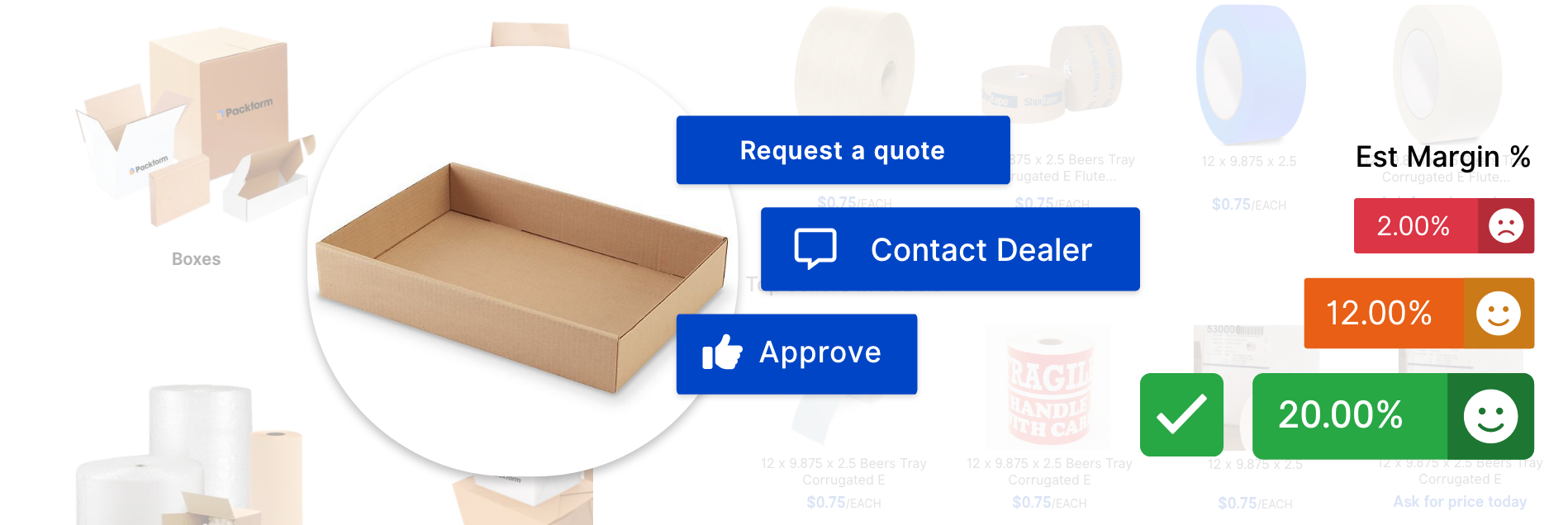
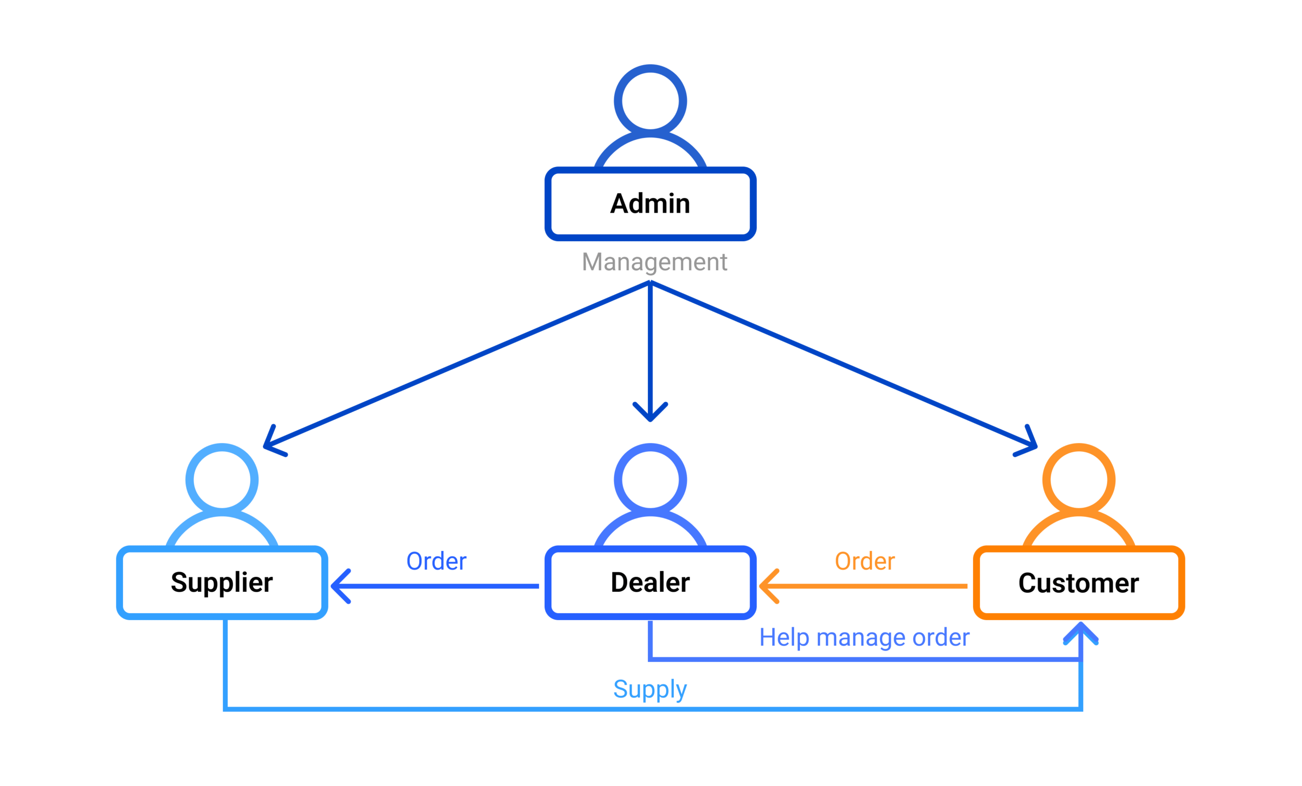
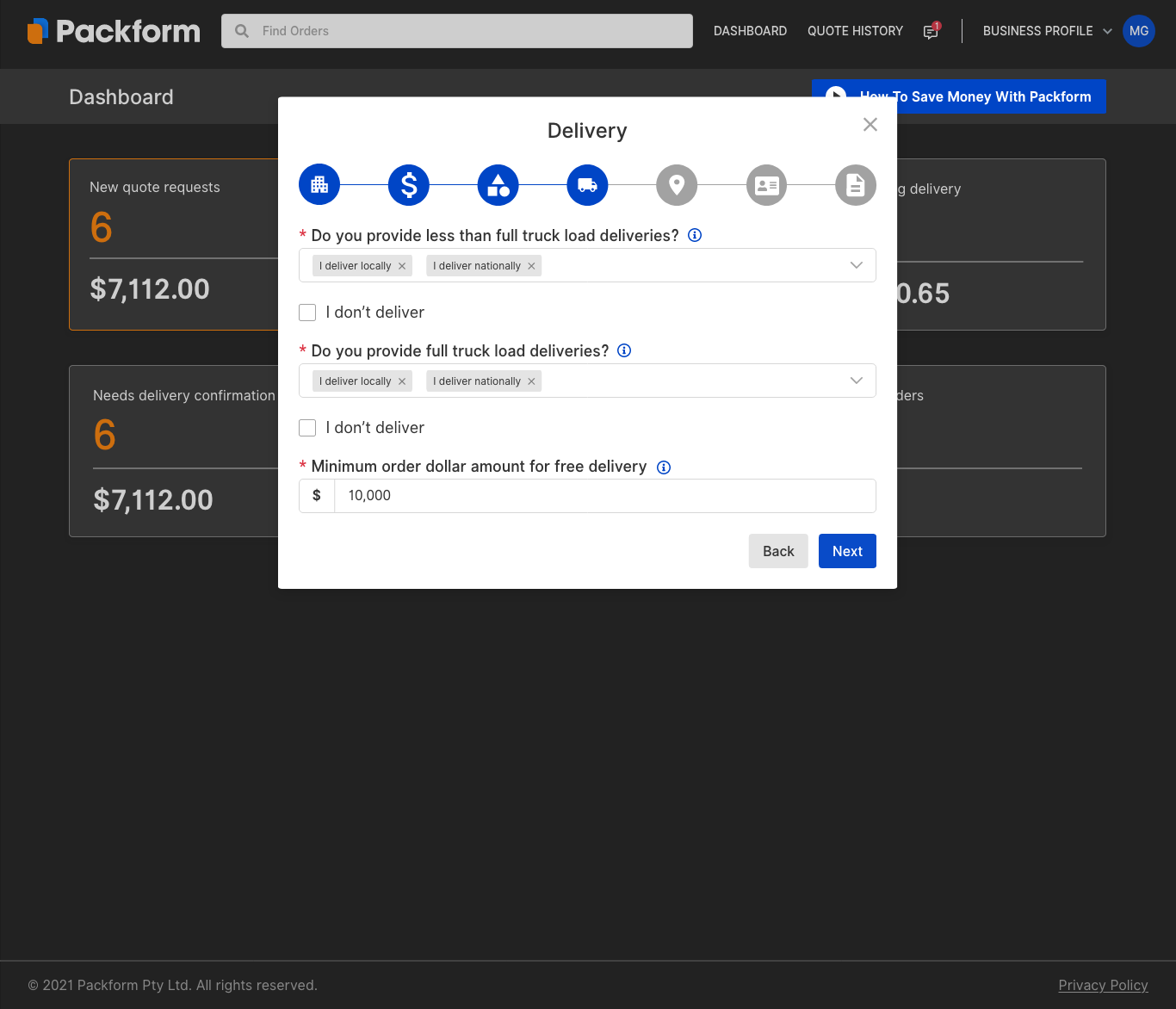
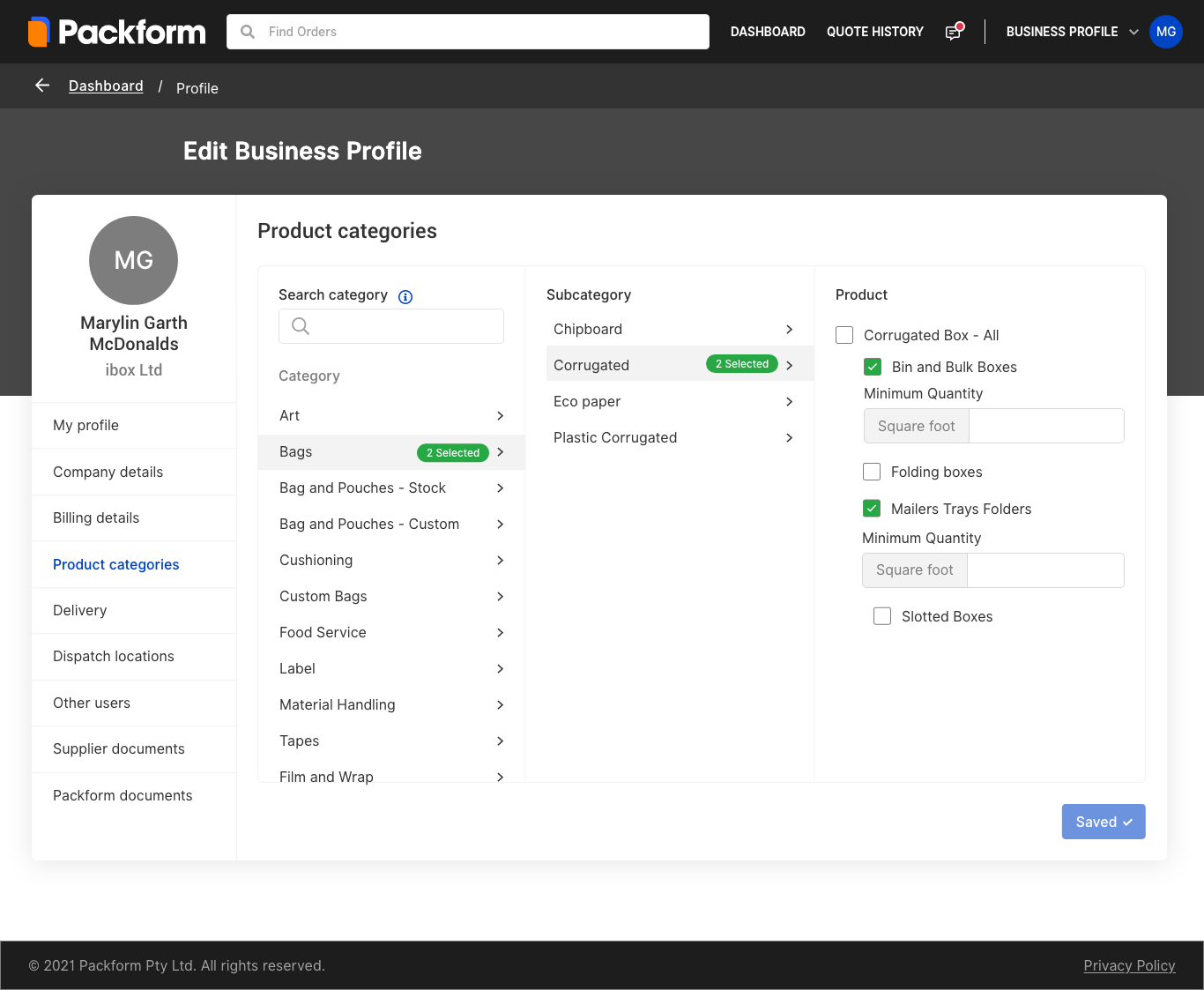
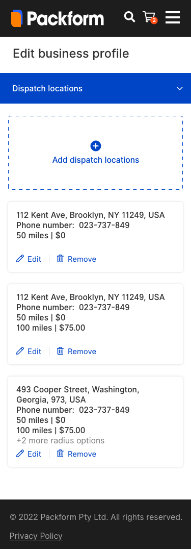
Key Finding (Interview):
Customers accessed the product catalogue through a small dialogue popup, limiting visibility and usability. The filtering system only allowed top-level category selection (e.g. Box) while ignoring deeper tiers like Box Type A or Size A. This forced users to scroll endlessly or rely on the search bar—which was ineffective for customers unfamiliar with product names or SKUs.
Solution 1:
I redesigned the catalogue to be full-page, with a clear three-tier category system. Filters were restructured to match the actual data hierarchy, allowing customers to progressively narrow down results with visual clarity. This improved discoverability, reduced browsing fatigue, and enabled a faster procurement flow.
Solution 2:
To address visibility and browsing issues, I removed the small catalogue popup entirely and redesigned it as a full-page tab within the main navigation—giving users more space to explore products without feeling constrained. When a user clicks on a product, a larger, standalone product detail modal appears, displaying clear visuals, key specs, and CTAs. This eliminated the clutter of stacked popups and created a more focused, seamless browsing experience.
Additionally, I introduced a “Build Your Own” feature for cases where users couldn’t find an exact match. This allowed customers to input custom measurements or specifications, which dealers could then use to source the most suitable product from the supplier network—ensuring no enquiry was left unresolved.
DEALER EXPERIENCE
Key Finding:
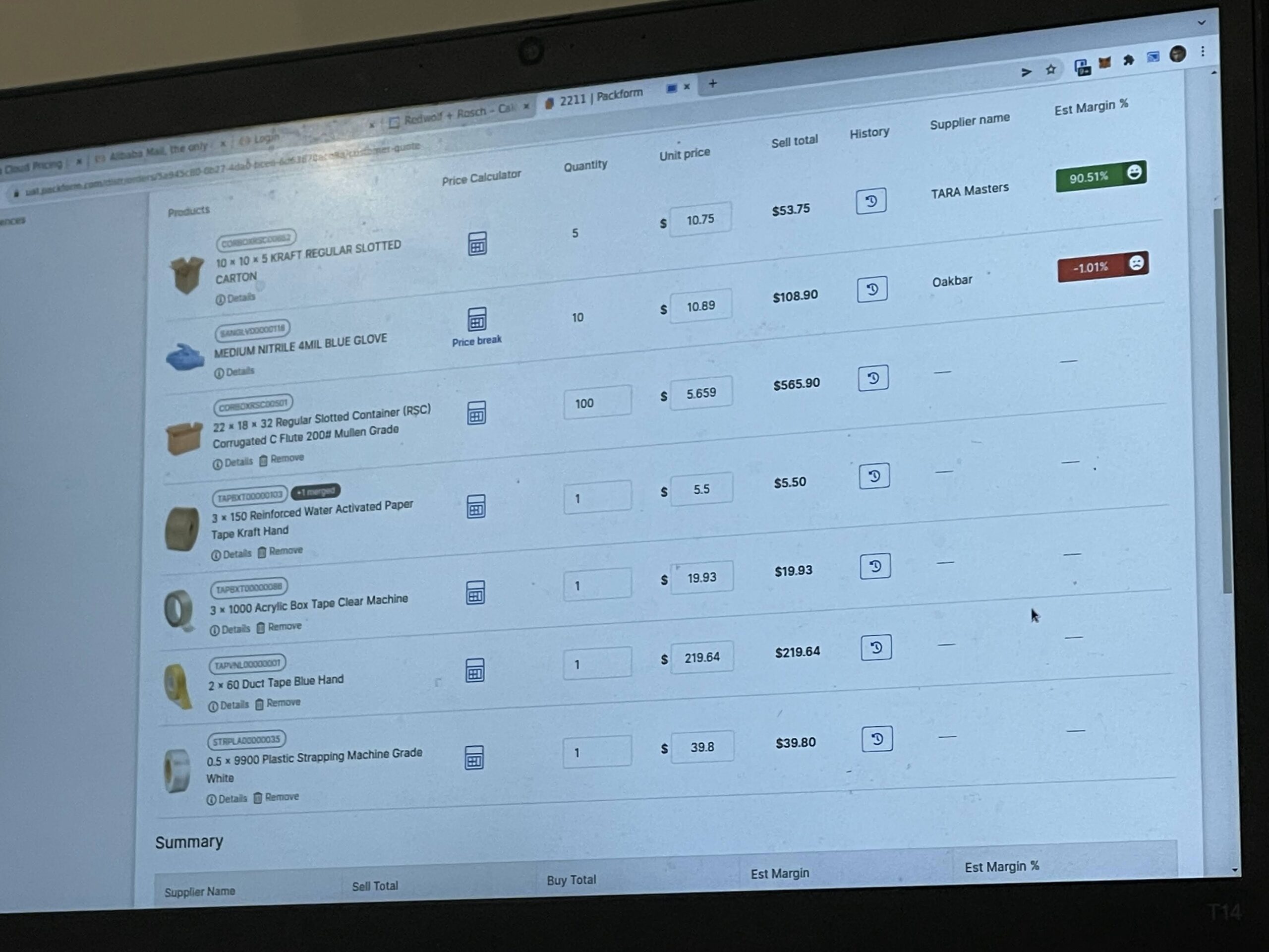
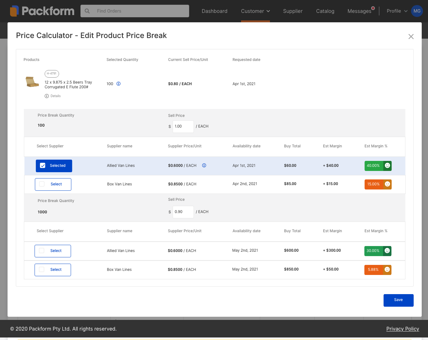
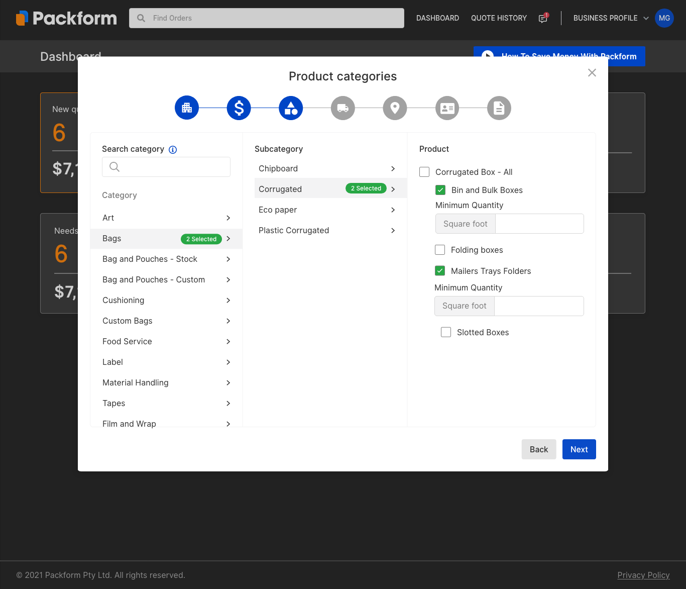
Dealers had no efficient way to compare multiple suppliers offering the same product. The system lacked a unified view or filtering tool to quickly assess pricing and availability side-by-side. As a result, dealers had to manually check each supplier one by one—slowing down quoting and making it harder to identify the best margin opportunity.
We were able to directly contact dealers via phone, thanks to their working contracts with Packform. This allowed us to gather rich, first-hand insights quickly, uncovering pain points in their day-to-day workflows and validating design decisions through real-world context.
My Design Process in Action
Whiteboard in Action
Mapping out gaps in the supplier comparison workflow and tracing the dealer journey from quote to margin.
Collaborative Problem-Solving
Working closely with the team to surface dealer pain points and align on the core UX issues through shared research insights.
Ideas Too Big for the Whiteboard
When the whiteboard wasn’t enough, we took over the glass door.
Testing in the Real Flow
Mimicking a dealer to observe and validate the UX firsthand.
Solution:
I designed a Smart Purchasing system to help dealers make better pricing decisions. They can now set tiered pricing for items—for example, charging $1 per unit for orders under 1,000, and $0.90 per unit for larger orders.
Dealers can also see all available suppliers for a product in one place, with prices and margins automatically calculated. This makes it easy to compare options and choose the supplier that gives them the highest profit.
🔴 SUPPLIER EXPERIENCE
Problem:
Suppliers had no onboarding interface or dedicated dashboard. As the platform was still in development, suppliers were being onboarded manually, with no way to manage their own profiles or track activity.
Fix:
Following the updated brand identity, I designed the full self-serve onboarding workflow, along with the ‘My Profile’ page and a dedicated supplier dashboard. This gave suppliers the tools to register independently, manage their information, and view real-time activity—laying the foundation for a scalable and professional supplier experience.
This is just a snapshot📸
I’d be happy to walk you through the full case study. Feel free to connect with me on Linkedin, email me at sunny.ha.design@gmail.com, or drop a message below.